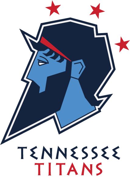
Brand Redesign
As an exercise, I decided to redesign an NFL logo that I never liked: The Tennessee Titans. The logo looked dated and also didn’t make any sense. The team is named after the Greek titans since Nashville is sometimes called the Athens of the South. The titans were the progenitors of the Greek gods, but nothing about the team brand referenced ancient Greek culture. The sword that is styled into a “T” is a cartoonish medieval sword and there are inexplicable flames coming off the emblem.
I decided to look back to ancient Greek depictions of Kronos, one of the most important titans and father to many of the Olympian gods. I found a striking image of him painted on an ancient amphora and I used that an inspiration for my new logo. I used the sharp angles I saw in that image and emphasized them to match the angles of the Greek alphabet-inspired typeface I used for the lettering. I also created an alternate logo consisting of two “T”s that form a letter mark similar to many baseball teams. I kept the three red stars of the original logo because they actually reference the three regions of Tennessee and their state flag, which keeps the brand grounded in local culture.


