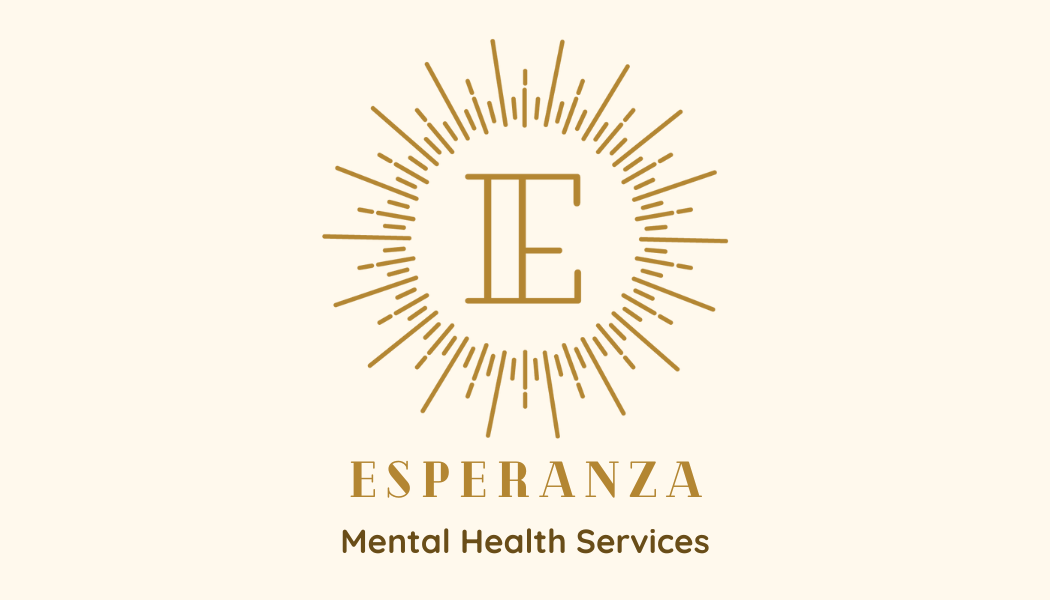
Esperanza Mental Health Services
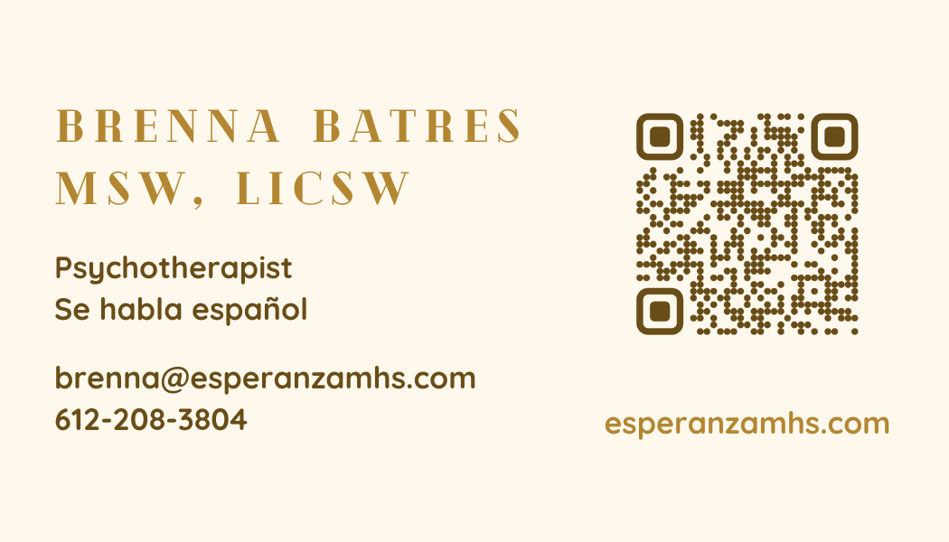
This was a pretty simple logo redesign. I started with a stylized sun radiating light and added a monoweight ‘E’ in for Esperanza. It is simple, elegant, and similar enough to the original to still be familiar. For the business cards, I choose a secondary sans-serif typeface that was rounded and friendly to compliment the more stylized serif wordmark. I used a creamy colored background and a dark brown to create a warm and natural tone.